10 Quotes About Color Every Abstract Art Collector Should Know

In short: These are ten verified quotes about color in art — five from working interior designers shaping rooms right now, and five from the painters and thinkers who built the vocabulary collectors still use. Read together, they make the case for color as a decision, not a decoration — the same case a real abstract painting makes on a wall.
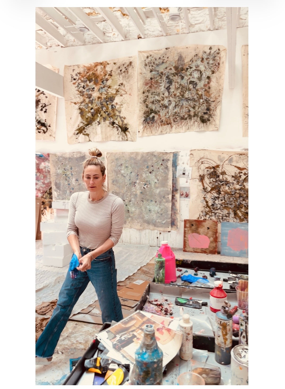
Angela Simeone is a Nashville-based contemporary abstract painter whose boutique luxury wallpaper line is created from her own paintings and composed — through her artistic and editorial eye — into layered, original, chic patterns, printed on a single luxurious 20 oz vinyl that looks like raw silk with a glimmering sheen, sold direct and to the trade.
Why Color Quotes Are Worth Reading Slowly
Every gestural, color-driven painting is an argument about color before it's anything else — before subject, before scale, before story. The ten voices below span a century and two very different rooms: the studio and the client meeting. Read together, they make a case a collector can use immediately — color in a serious painting is never decoration. It's the whole decision.
Pam Shamshiri: "It's Not Just A Color, It's A Feeling"
Pam Shamshiri, co-founder of the Los Angeles firm Studio Shamshiri, set a burgundy lacquer wall behind a Carlo Bugatti throne chair in a West Village project and described the color as alive under changing light: "It reflects light in a way that feels alive, changing throughout the day from deep plum to glowing cherry, depending on the atmosphere," she says. "It's an incredibly effective color, because it sits between worlds. It brings emotion into a space without overwhelming it." That's the same test worth applying to a painting before it goes on a wall — does the color change with you, or does it sit there flat.
Noz Nozawa: Pastels That Refuse To Be Named
Noz Nozawa, founder of the San Francisco firm Noz Design, has been building rooms around colors that resist a clean label. "Pastels always feel cheerful — somewhere between a soft color and a confidently low-key statement," she says, describing her current palette as "yellows that are halfway to cooked-leek green, lavenders that are also sort of pink, mauves that are almost gray." A serious painter's palette works the same way — the color in a real canvas is rarely the color you'd name from across the room.
Kanika Design: Color Isn't The Risk
The Bay Area firm Kanika Design put the collector's real hesitation about bold color into one line: "Color isn't a risk. The risk is a room so careful that no one remembers being in it." It's the same argument for hanging a real, color-forward original instead of something neutral and safe — the forgettable room is the actual risk, not the confident one.

Georgia O'Keeffe: Color As A Language With No Words
Georgia O'Keeffe described color as the thing that let her say what she couldn't say any other way. In a 1930 letter to William Milliken, she wrote: "Color is one of the great things in the world that makes life worth living to me and as I have come to think of painting it is my effort to create an equivalent with paint color for the world – life as I see it." For a painter working in oil and mixed media, that's not sentiment — it's a working method. Color carries what the subject can't.
Henri Matisse: "An Energy That Seems To Stem From Witchcraft"
Matisse's 1908 essay "Notes of a Painter" is still the clearest first-person account of what color actually does to a canvas. "With color one obtains an energy that seems to stem from witchcraft," he wrote — insisting that "the chief function of color should be to serve expression as well as possible." More than a century later, that's still the standard a serious color-driven painting has to clear.
Vincent van Gogh: Color As A Relationship, Not A Choice
Writing to his brother Theo from Arles in September 1888, Van Gogh described color as a way to paint feeling directly, without a figure or a story to carry it: "To express the love of two lovers by a marriage of two complementary colors, their mingling and their opposition, the mysterious vibrations of kindred tones." That's the same logic behind a layered, scraped-back abstract surface — the relationship between two colors is doing the emotional work, not any single one of them alone.
Franz Marc: Color As Character
The German Expressionist Franz Marc assigned color almost a personality, writing to fellow painter August Macke in November 1910: "Blue is the male principle, astringent and spiritual. Yellow is the female principle, gentle, gay and spiritual. Red is matter, brutal and heavy and always the color to be opposed and overcome by the other two." Whether or not a collector buys the specific symbolism, the instinct is right — real color choices in a serious painting are never arbitrary.
Wassily Kandinsky: Color As A Physical Force
Kandinsky's 1911 treatise "Concerning the Spiritual in Art" argued that color acts on the body, not just the eye: "Color hides a power still unknown but real, which acts on every part of the human body." It's a claim worth testing in person — stand in front of a large, color-saturated original and the effect is closer to weather than decoration.

What This Means For Buying Color-Driven Work
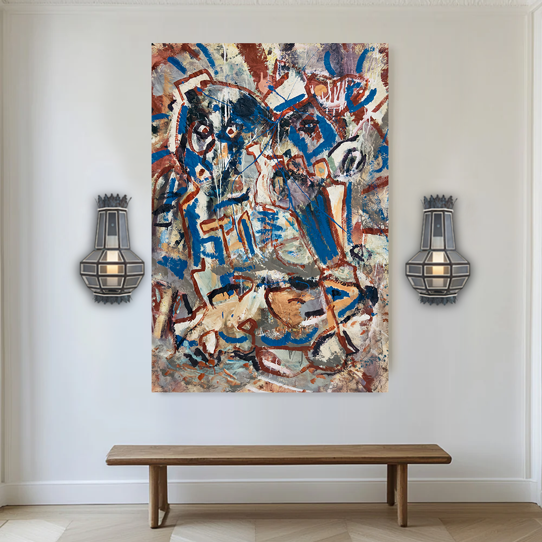
None of the ten voices above are describing color as a finishing touch. They're describing it as the argument the whole piece is making. That's the standard worth applying to any large-scale abstract painting under consideration — including the color-driven originals currently available in the studio, each one-of-one and sold exactly once. For designers building a room or a hospitality project around one anchor piece, Angela also takes commissions — including a specific palette painted to match a room's existing color story.
Frequently Asked Questions
Why do art advisors and designers keep returning to color when they talk about a painting?
Because color is the fastest, most physical thing a viewer reacts to — before subject, before technique, before price. A painting's color relationships are usually the first real clue to how resolved the work actually is.
Does a bold color palette limit where a painting can hang?
Not in a well-composed piece. As Pam Shamshiri notes, an effective color "sits between worlds" — it reads as confident rather than matchy, which is why designers increasingly build a room's whole scheme around one strong color-driven original rather than choosing a painting to match existing furniture.
Is there a difference between color in a painting and color in a printed pattern?
Yes — a painting's color comes from built-up, physical layers of pigment that shift with real light. That's also the starting point for Angela's wallpaper line: every pattern begins as an actual painted surface before it's set into repeat.
How do I know if a color-driven original will work in my space before I buy it?
Angela sends multiple pre-ship videos of every finished painting in real light before it ships, so a collector or designer can see exactly how the color behaves before committing.
Ready to see color-driven originals in person? Browse available paintings or start a commission conversation at angelasimeone.com.
Sources: Pam Shamshiri and Noz Nozawa quoted in "The 1stDibs Guide to 2026 Designer Trends," Erika Heet, 1stDibs, Nov. 21, 2025. Kanika Design quoted in "Fearless Living Room Colors: How to Design with Bold Hues," Kanika Design. Georgia O'Keeffe quoted in Laurie Lisle, "Portrait of an Artist: A Biography of Georgia O'Keeffe," 1981 (letter to William Milliken, 1930). Henri Matisse, "Notes of a Painter," La Grande Revue, Dec. 25, 1908. Vincent van Gogh, letter to Theo van Gogh, Arles, September 1888. Franz Marc, letter to August Macke, November 1910, quoted in Wolf-Dieter Dube, "Expressionism," Praeger, 1973. Wassily Kandinsky, "Concerning the Spiritual in Art," 1911.