Should Your Art Match Your Sofa? How a Painting Leads the Room
TL;DR: Art doesn’t need to match your sofa. The painting that works is the one that gives the room its color story — not the one that coordinates with the upholstery.
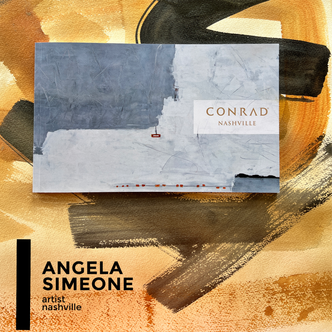
Angela Simeone is a Nashville-based contemporary abstract painter whose boutique luxury wallpaper line is created from her own paintings and composed — through her artistic and editorial eye — into layered, original, chic patterns, printed on a single luxurious 20 oz vinyl that looks like raw silk with a glimmering sheen, sold direct and to the trade.

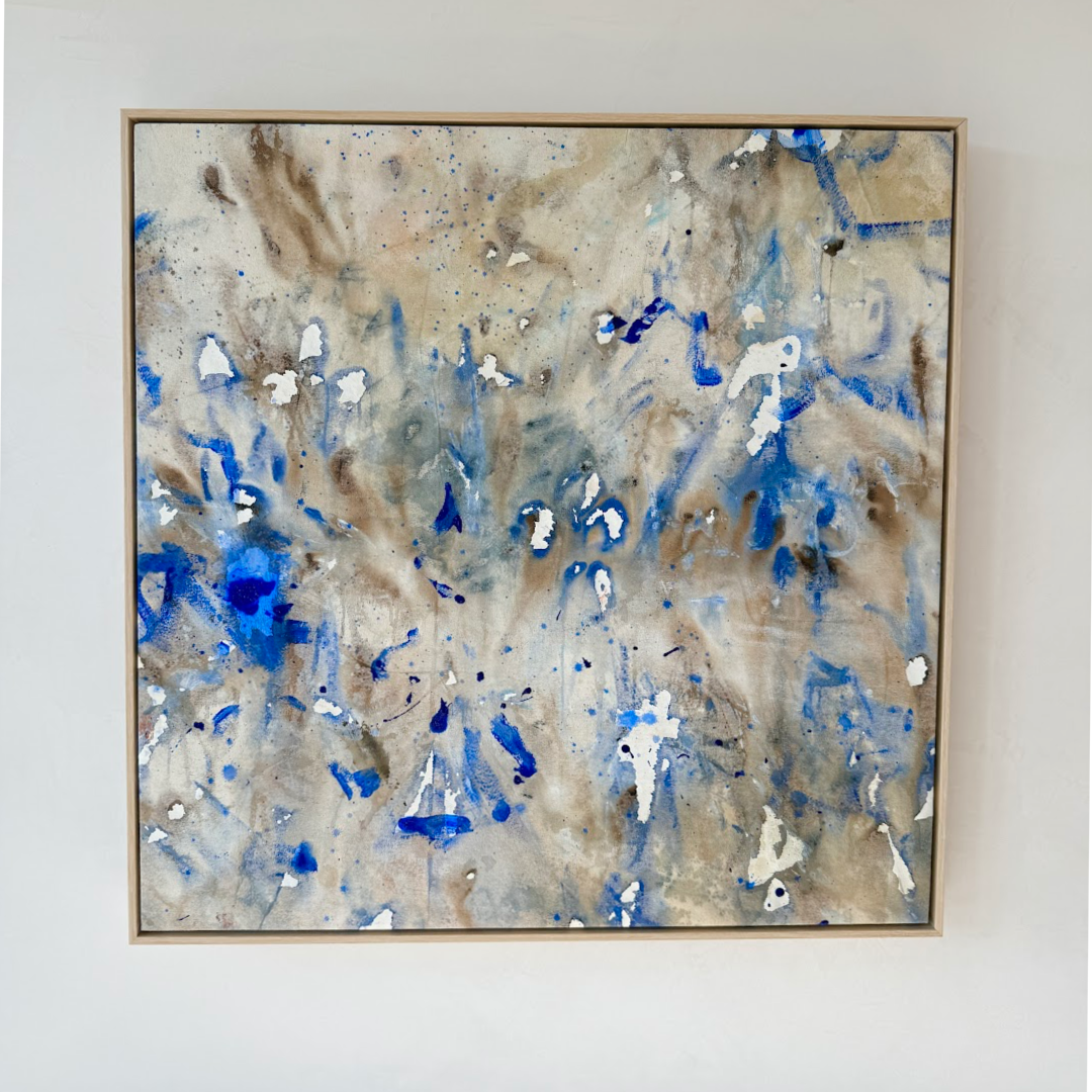
Azul Chroma Brown Natural White, original oil on canvas, $5,850 — available now.
Should Your Art Match Your Sofa?
The question comes up in nearly every residential collector conversation: “Will this work with my sofa?” or “I love it — but does it go with my room?”
The answer, from designers and collectors who’ve been doing this for decades, is consistent: the right painting doesn’t match the room. It leads it.
Choosing a painting to coordinate with existing upholstery locks you into whatever your sofa happens to be. What you actually want is a painting that gives the whole room its direction — the fixed point the rest of the space defers to. That flip in thinking changes everything about what you look for.
What Color Theorists Actually Say
Color in painting doesn’t behave like color in a fabric swatch. A well-built abstract contains multiple values — warm darks, cool lights, mid-tones that shift depending on the hour and the quality of light in the room.
Josef Albers spent a career demonstrating exactly this. As he wrote in Interaction of Color (Yale University Press, 1963): “Color is the most relative medium in art.”
That relativity is the point. A painting you see in a gallery under 3000K lighting will read differently hung over your fireplace in afternoon sun. That’s not a problem — it’s the painting working. And it’s why trying to match a static swatch to a dynamic painting is always the wrong question.
Why Art-First Makes a Room
Abstract painter Joan Mitchell worked from landscapes she carried in memory — not from a model or reference in front of her. “What I carry in me is the feeling that I’ve absorbed from looking at the landscape,” she said. “The painting is ultimately more real for me than the landscape.” (Joan Mitchell Foundation; Art in America.)
That quality — a painting that holds something irreducible — is what makes original art different from a beautiful object that coordinates with furniture. When a designer builds a room around a painting, the painting stays primary. The rugs, the linen, the wood tones all respond to it. The room has a center of gravity.
On Breaking Rules
Helen Frankenthaler, one of the defining abstract painters of the twentieth century, put it plainly: “There are no rules. That is how art is born, how breakthroughs happen. Go against the rules or ignore the rules. That is what invention is about.” (The New York Times; Gagosian Gallery.)
The instinct to match art to furniture is, at its core, a rule — a precautionary one designed to avoid a mistake. Most of the time, following it produces a room without a point of view.
Color as the Language of a Room
Paul Klee understood color as communication between mind and world: “Color is the place where our brain and the universe meet.” (Klee, Notebooks; MoMA.)
For collectors buying original abstract work, this means the painting isn’t a passive object that needs to match anything. It’s a presence in the room. Choose the painting because it holds your attention and carries a color story that gives the space direction.
What an Art Advisor Would Tell You
Philip Hoffman, founder of The Fine Art Fund, is one of the power advisors featured in Cultured Magazine’s “7 Commandments for Rookie Collectors” (Julia Halperin, April 22, 2026).
“They think that getting something they like at a discount is a bargain,” he said. “The discount is irresistible, and then they find that they bought absolute garbage. You know what we are notorious for? Stopping our clients from buying 90 percent of everything they are offered.”
The same logic applies here. The painting that coordinates with the throw pillows is the one you’ll tire of in three years. The painting that leads the room is the one you’ll rearrange the throw pillows around.
Paintings Currently Available
Azul Chroma Brown Natural White · original oil on canvas · $5,850 — blue and warm natural across a white ground; suits rooms in linen, white oak, and cream.
Chroma Navy Grey Lilac Brown Natural Canvas Painting · 48×60 in · $7,850 — deep navy and muted lilac over warm earth; the anchor in a neutral room.
Marigold Blue Grey Coffee Brown Natural Canvas Abstract Oil Painting · 52×52 in · $7,850 — warm chromatics with a cool grey-blue counterweight; works with sand, linen, slate, and warm white.
All ready-to-ship. Flat $250 delivery. Pre-ship real-light video available on request.
Browse all available paintings →
Commission a painting at your size and palette →
FAQ
Does art really need to match my sofa or decor?
No. Art doesn’t need to match your furniture — it needs to hold the room. Choose a painting whose palette gives the room direction: neutral furnishings respond to a painting with a strong color story, while rooms with pattern or color benefit from an abstract that anchors rather than competes.
What’s the easiest way to tell if a painting works in my room before buying?
Request pre-ship video in your actual light. Many independent artists, including Angela Simeone, will film the canvas in real light on request before it ships — so you see the painting in motion before it arrives, not under studio lights in a photograph.
Should I choose art before or after furnishing a room?
Most designers and experienced collectors choose art first. The painting gives you a fixed color reference — from there, you choose textiles, rugs, and upholstery to complement it. Choosing art last means fitting a painting into a room that wasn’t designed to hold one.
How do I know if an abstract painting will feel overwhelming in a neutral room?
Scale and value range matter more than color. A large abstract with a full value range in a neutral room reads as intentional — it becomes the focal point. Rule of thumb: the painting should cover 60–75% of the wall width above a sofa, or stand independently on a feature wall at 48 inches or wider.
Sources: Josef Albers, Interaction of Color, Yale University Press, 1963 · Joan Mitchell, Joan Mitchell Foundation; Art in America · Helen Frankenthaler, The New York Times; Gagosian Gallery · Paul Klee, Notebooks; MoMA · Philip Hoffman, “7 Commandments for Rookie Collectors,” Julia Halperin, Cultured, April 22, 2026.